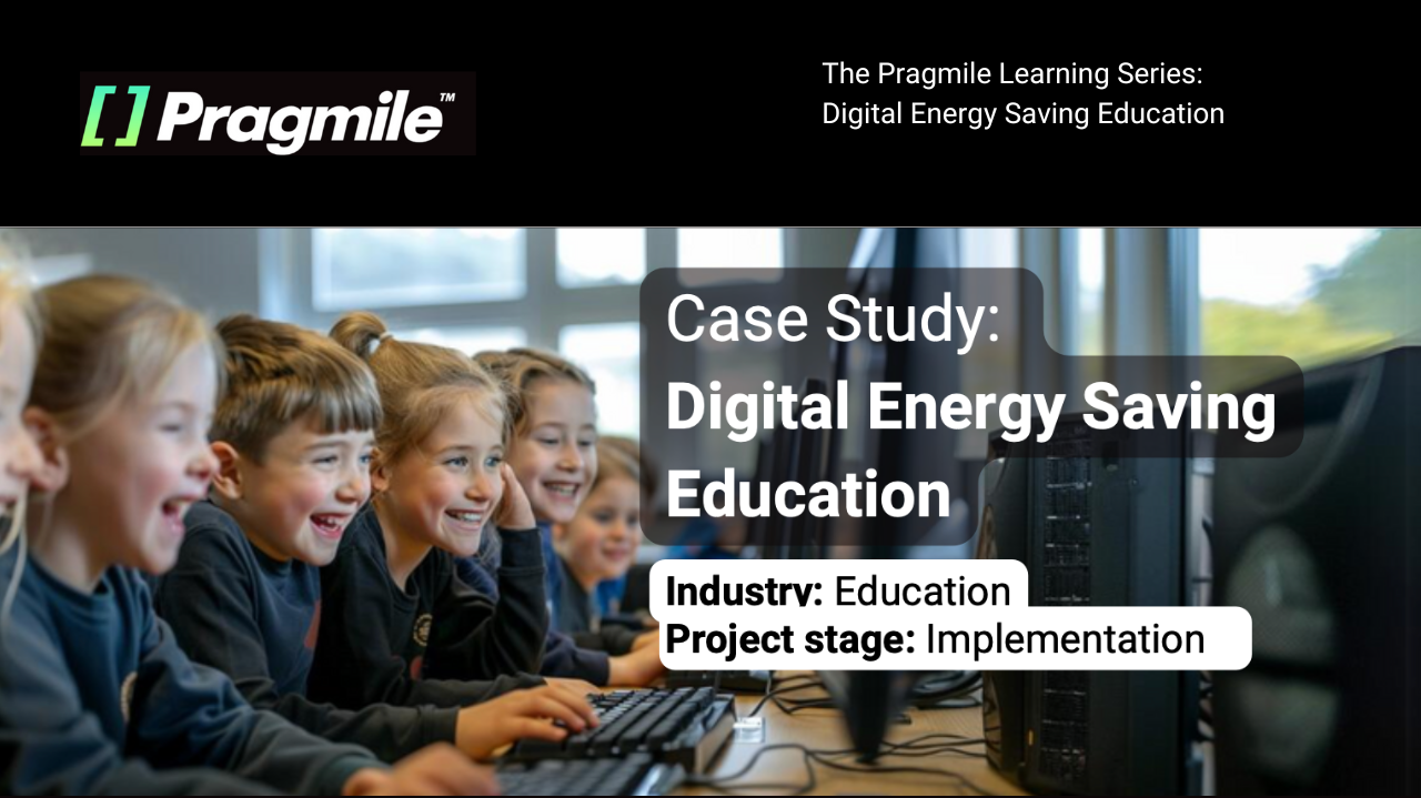
Case Study: Digital Energy Saving Education
Introduction
A company called Danfoss sought to leverage data visualization technologies to revolutionize the way energy data is managed and analyzed, reducing manual data processing efforts and introducing efficient, automated solutions to enhance educational outreach and oversight, resulting in the improved overall energy education effectiveness.
Our Achievements:
- Created an energy-saving educational platform for primary school pupils, handling data from 24 units.
- Simplified energy data into accessible visuals, improving understanding.
- Enhanced energy awareness among pupils, fostering sustainability.
- Earned positive feedback, validating the platform’s impact.
Client Benefits:
- Enhanced pupil engagement with intuitive data visualizations.
- Simplified energy concepts for better understanding.
- Integrated tools into school curricula for improved interaction.
- Promoted proactive energy-saving practices through interactive learning.
The Problems:
Danfoss faced several challenges in their energy education initiatives, including:
- Challenges in presenting complex energy data in an understandable way for young learners.
- Delays in effectively communicating the importance of energy conservation due to traditional teaching methods.
- Absence of a unified platform to demonstrate and analyze energy usage effectively.
- Inconsistencies in the educational material that impacted the accuracy and effectiveness of teaching energy savings.
Our Solution:
The initiative at Danfoss was strategically devised to utilize advanced data visualization techniques to effectively communicate energy usage and conservation methods to primary school pupils. The goal was to make the concept of energy savings accessible and engaging through an interactive platform that could illustrate real-time data in a visually appealing manner. Driven by the aim to enhance educational outreach and simplify complex information, our solution focused on creating a user-friendly interface that could transform abstract energy data into tangible learning experiences. This approach not only facilitated easier understanding among young learners but also encouraged their active participation in energy conservation practices. The successful implementation of this visualization platform marked a significant advancement in educational technology, providing a dynamic tool for environmental education.
Path to Success:
- Data Collection and Sorting: The project commenced with collecting and sorting data from various sensors measuring different energy usage parameters like water usage and air temperature. This phase was crucial for establishing a solid data foundation for visualization.
- Initial Data Visualization Development: The team dedicated efforts to creating the first version of the data visualization tool, focusing on converting raw data into a format understandable by primary school pupils, using icons and simple examples.
- Refinement and Enhancement of Visualization: Following feedback and initial testing, the team moved on to refine and enhance the visualization tool, making it more interactive and engaging for the pupils, ensuring the content was age-appropriate and educational.
- Platform Integration and Testing: The enhanced visualization tool was integrated into the existing educational framework of the school, followed by comprehensive testing to ensure usability and clarity for the target audience.
- Launch and Continuous Improvement: The final step involved the official launch of the platform to the school, coupled with ongoing iterations based on user feedback and evolving educational goals. This step ensures the tool remains relevant and continues to effectively teach energy conservation.
Results:
The team developed and successfully launched an interactive data visualization platform that processes data from multiple sensors, enhancing energy education for primary school pupils. This platform has become a vital tool in teaching young learners about energy conservation effectively.
Conclusion:
The successful implementation of this data visualization platform has significantly reduced complexities in teaching energy conservation and improved the clarity and engagement of educational content. These improvements have streamlined the learning process and increased the effectiveness of the education program.
Key Takeaways from Danfoss’ Journey:
- Engaging with real user needs is essential for developing functional and effective educational tools.
- Managing and visualizing complex data effectively is crucial for delivering clear and impactful educational messages.
- Continuous refinement and user feedback are key to maintaining the relevance and effectiveness of educational tools in dynamic learning environments.
What Pragmile Offers:
As Pragmile continues to push the boundaries of innovation, businesses that partner with us can expect to benefit from their deep expertise, cutting-edge technologies, and commitment to delivering bespoke solutions. By harnessing the power of AI, Computer Vision, and Machine Learning, Pragmile empowers organizations to build a future where ideas meet expertise, driving transformative results across industries.
Empowering projects with our High-Performance Developer Teams.
Harnessing the power of AI, Computer Vision, and Machine Learning to craft pioneering solutions.
Utilizing our Infrasenses technology makes tech solutions smart, intuitive, and predictive.
Creating robust AI-driven platforms and developing bespoke tech solutions tailored to your needs.
Schedule a free consultation with
our AI and technology experts
Take advantage of the latest AI solutions, tailored to your company's needs. Book a consultation with AI solution architects at Pragmile and discover new opportunities in energy management.
Please, provide your business email to schedule a meeting